Invesnity

See the Web
https://invesnity.com/
I joined the company as a Senior UX/UI Designer and was promoted to Lead within six months. In this role, I restructured and improved the design process by leveraging my prior experience, particularly the knowledge gained from my time at Kaidee.
I was closely involved in every stage of the process, including research, usability testing, validation, design system development, final UI design, and handoff to developers, ensuring smooth collaboration across teams.
At the beginning, the UX/UI team consisted of five designers. Over time, the team expanded to nine designers under my leadership. I conducted monthly one-on-one sessions with each team member to provide guidance, address challenges in a timely manner, and support their professional growth. Throughout my two years in this role, there was zero turnover within the team.
Objective
To simplify investing and reduce time spent on individual stock research
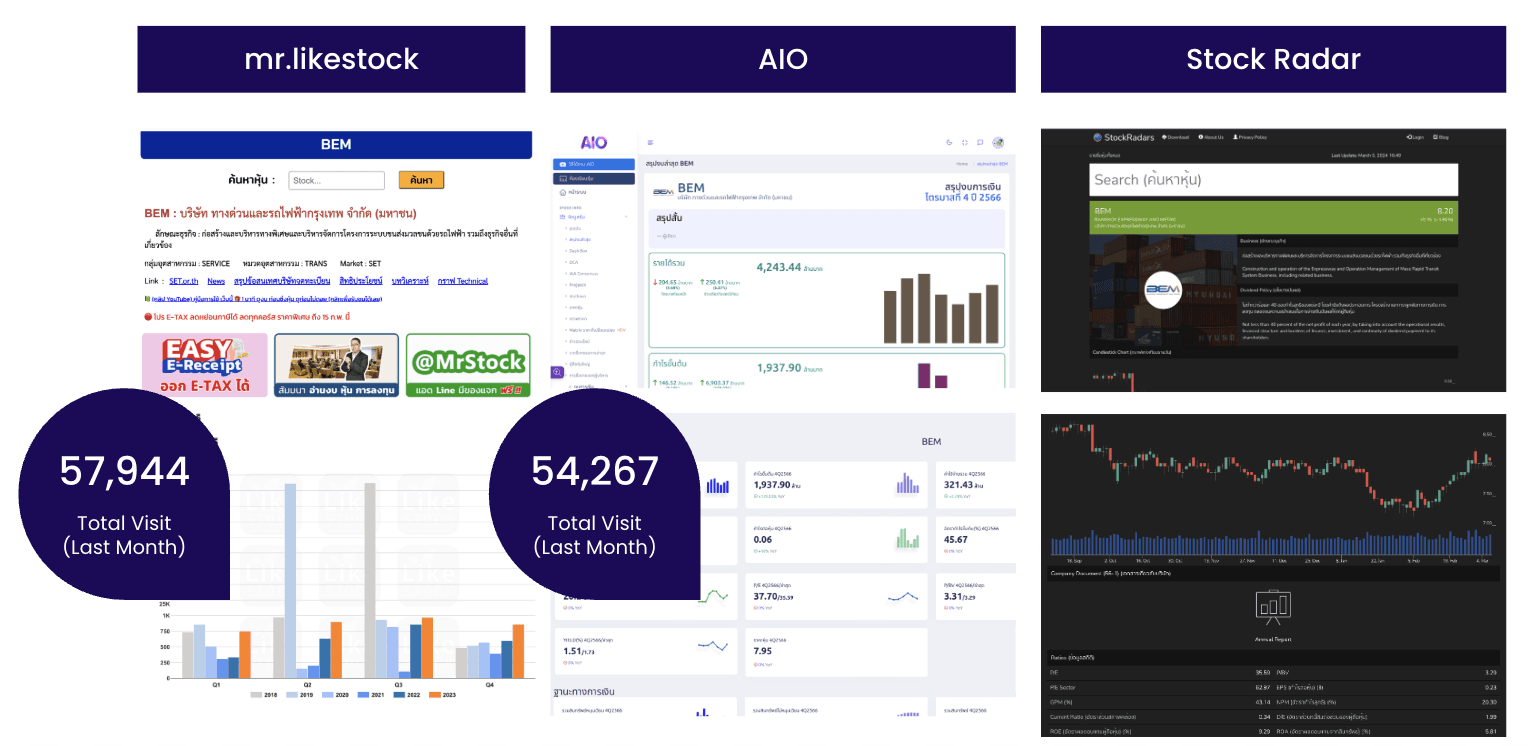
Research Methodology
Quantitative research through questionnaires
Qualitative research through user interviews
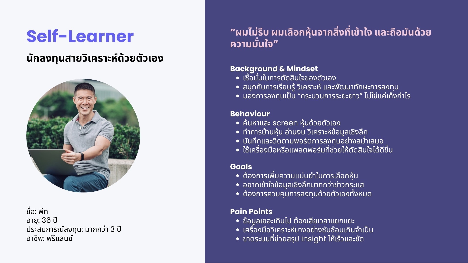
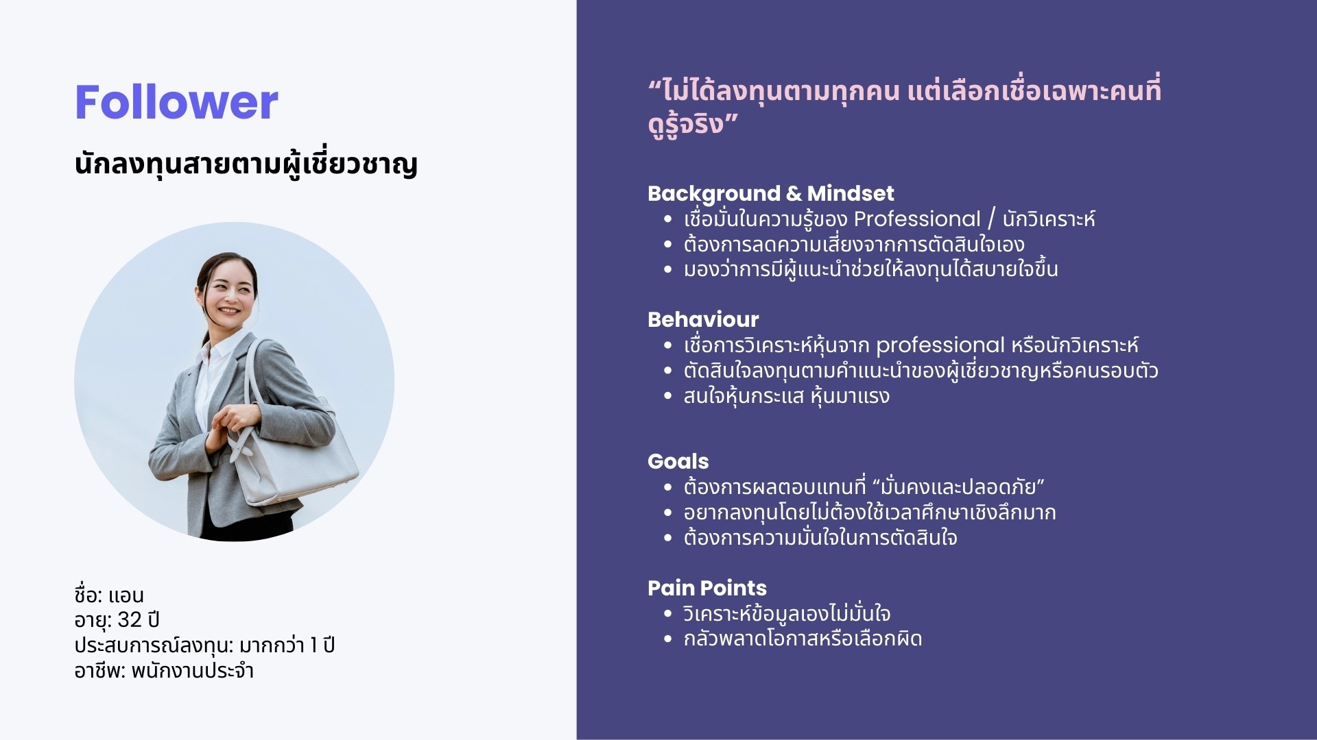
Persona
Mandatory
Demographic | Behavioral |
|---|---|
Must be Thai | Must hold Thai common stocks |
Spectrum
Job | Exp. Level (Years) | Type of Investment |
|---|---|---|
Open to all job types except those related to fintech careers (Business Conflict) | No Exp | VI |
User Journey
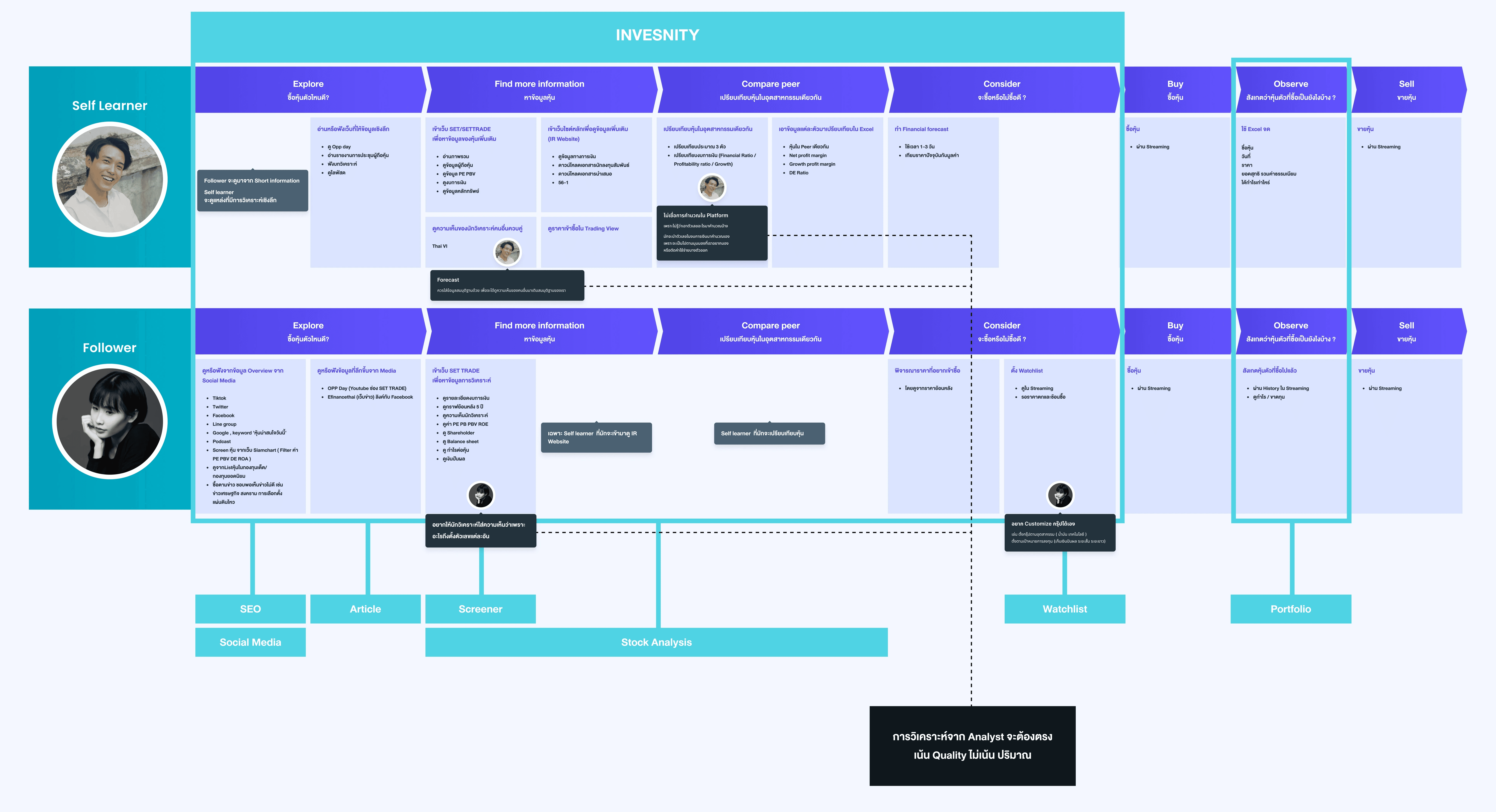
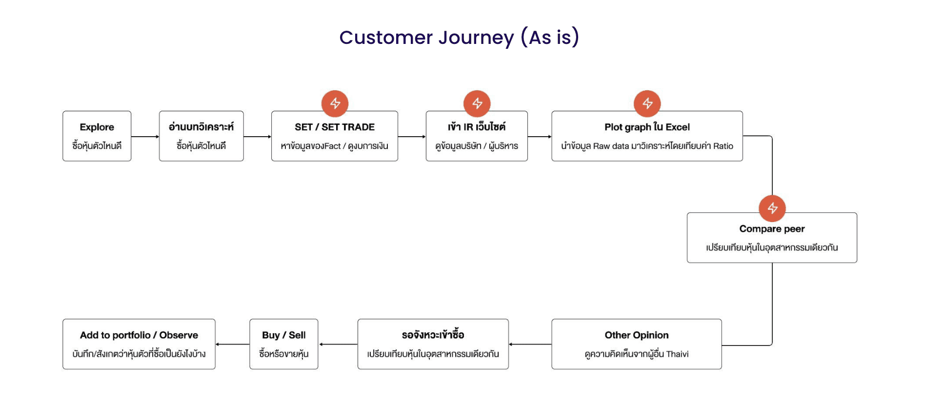
Pain Point
Value investors spend a significant amount of time analyzing data for individual stocks.
How Might We
How might we help value investors reduce the time spent on individual stock analysis, while increasing efficiency and making the experience easy to use for those who are new to investing?
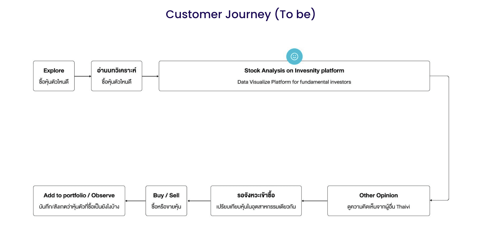
Solution
• Graph Summary
Graph Summary translates chart data into clear, easy-to-understand explanations, helping beginner users quickly grasp key insights without needing advanced data interpretation skills.
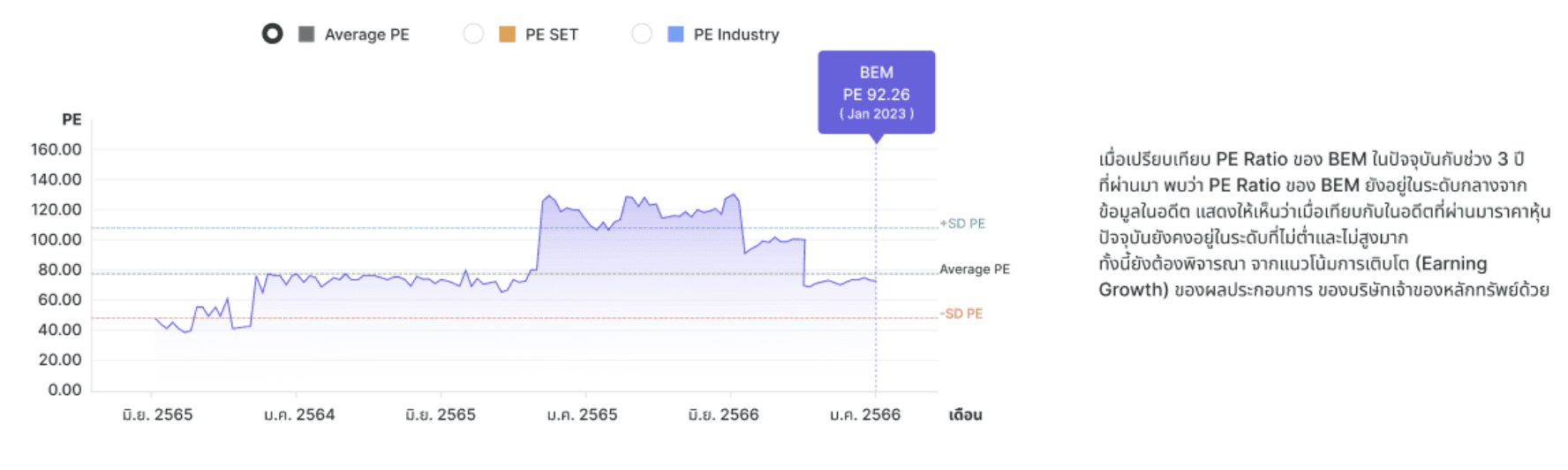
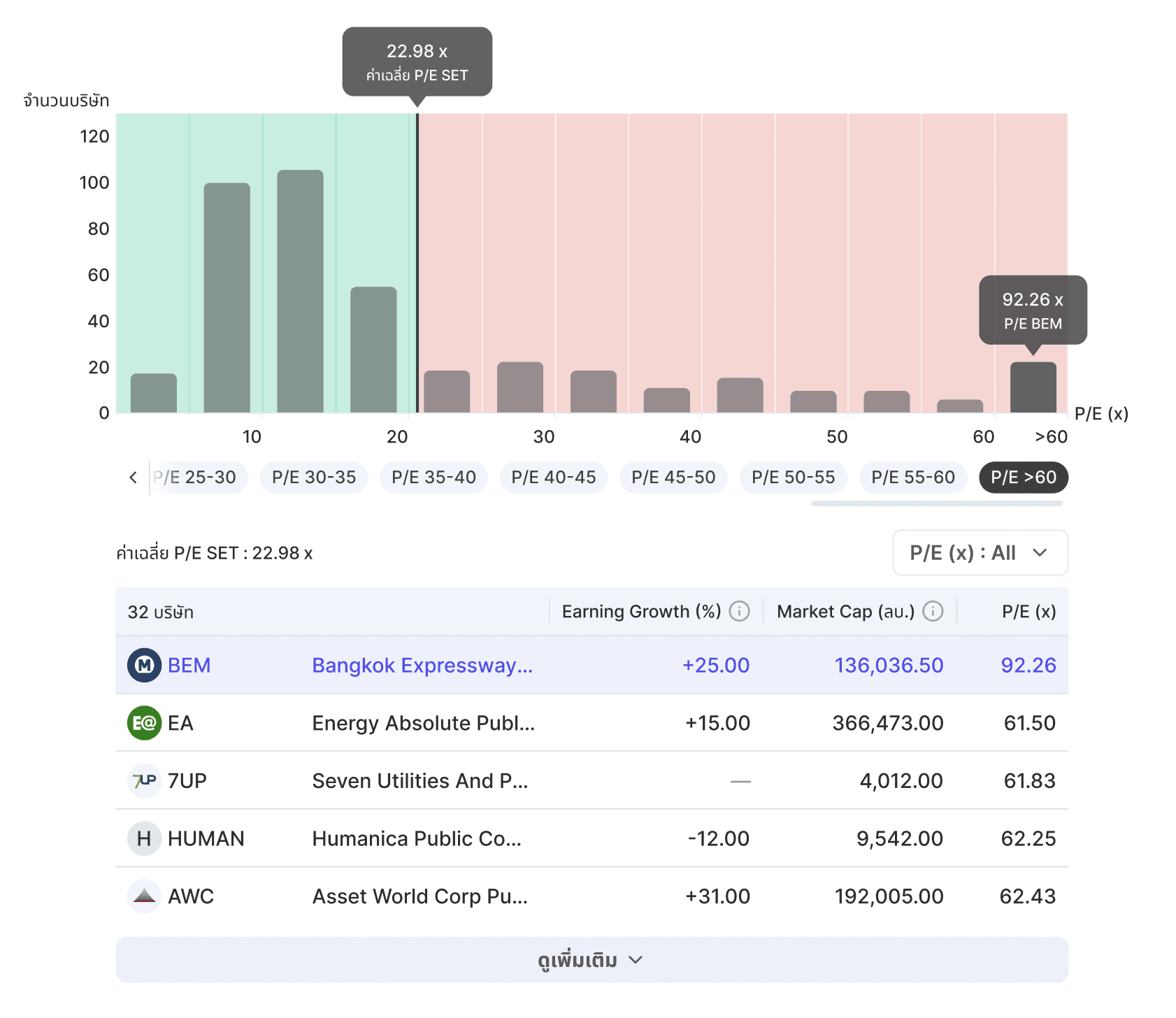
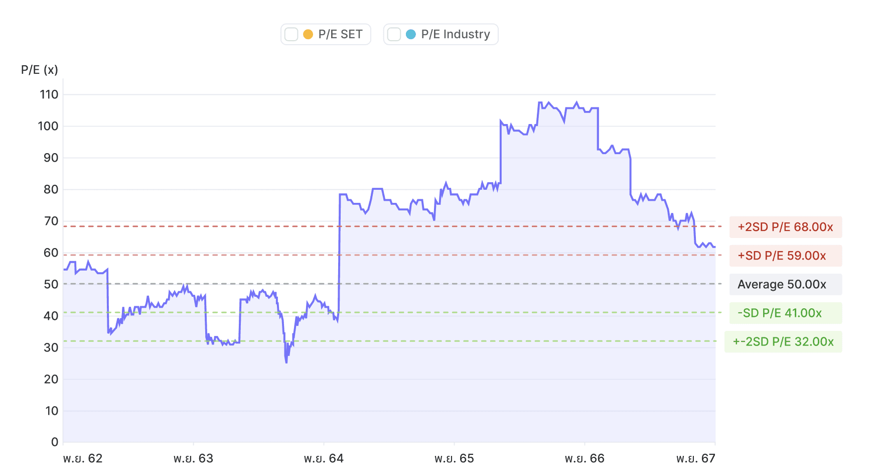
• New Graph to compare Financial Ratio with the Market
A new graph that visualizes financial ratios in comparison to the overall market (e.g., P/E vs. Market), helping users understand market-level benchmarks at a glance.
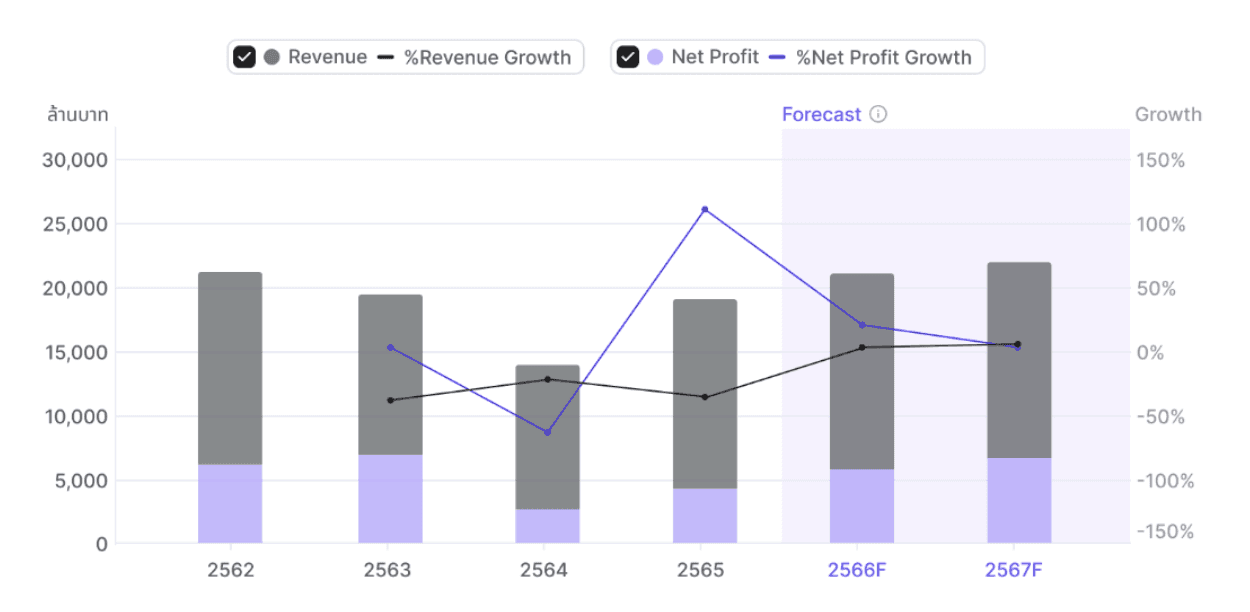
• Financial forecasts
Users can access financial forecasts from an analyst’s perspective, including projected revenue and net profit.
• Competitor selection
The platform allows users to customize competitor selection based on their analysis needs.
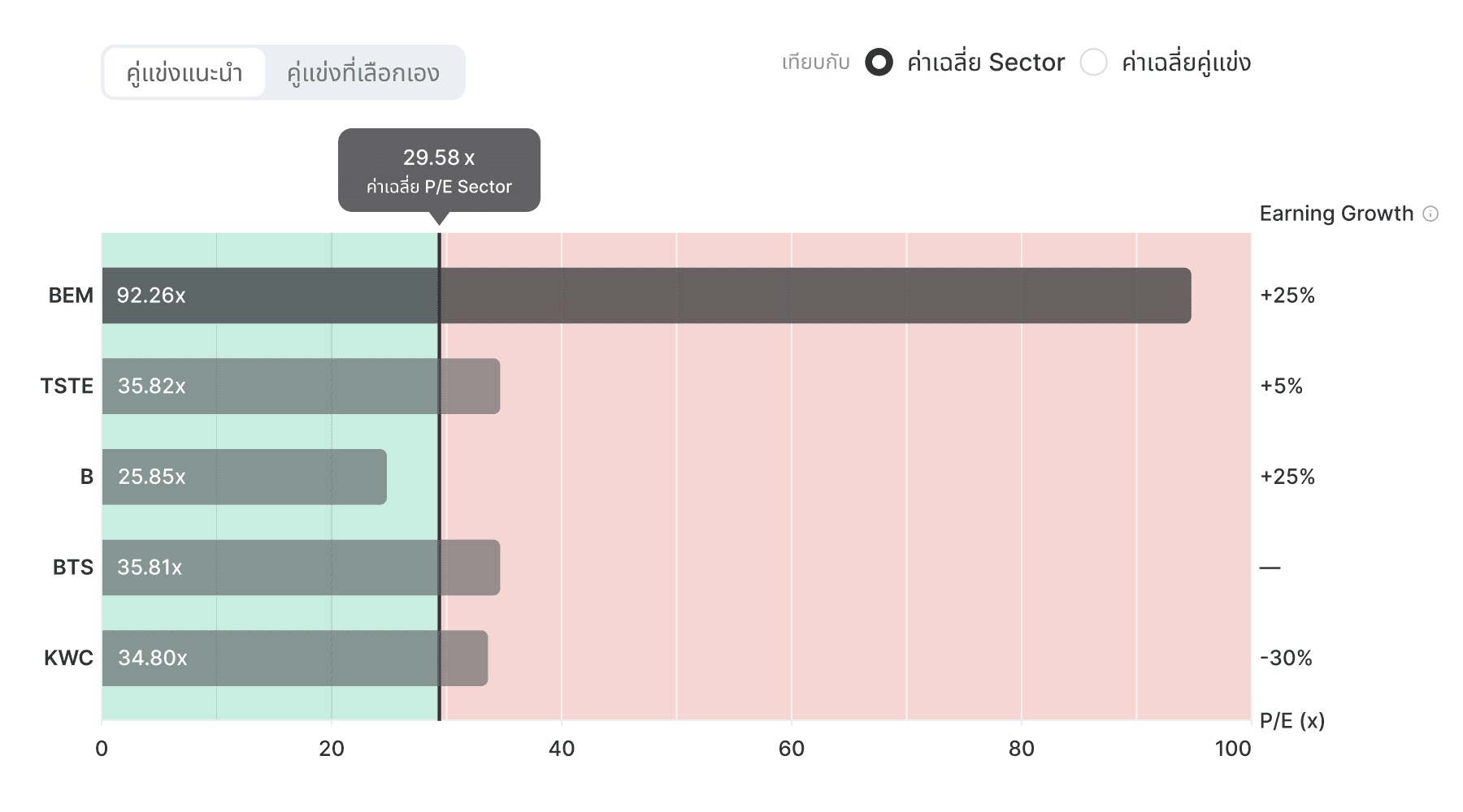
• Financial Benchmark
Users can benchmark financial metrics against the SET index or comparable companies within the same industry.
Prototype
Usability Testing
Usability testing was conducted on the Useberry platform through task-based, unmoderated testing, followed by post-task user ratings.
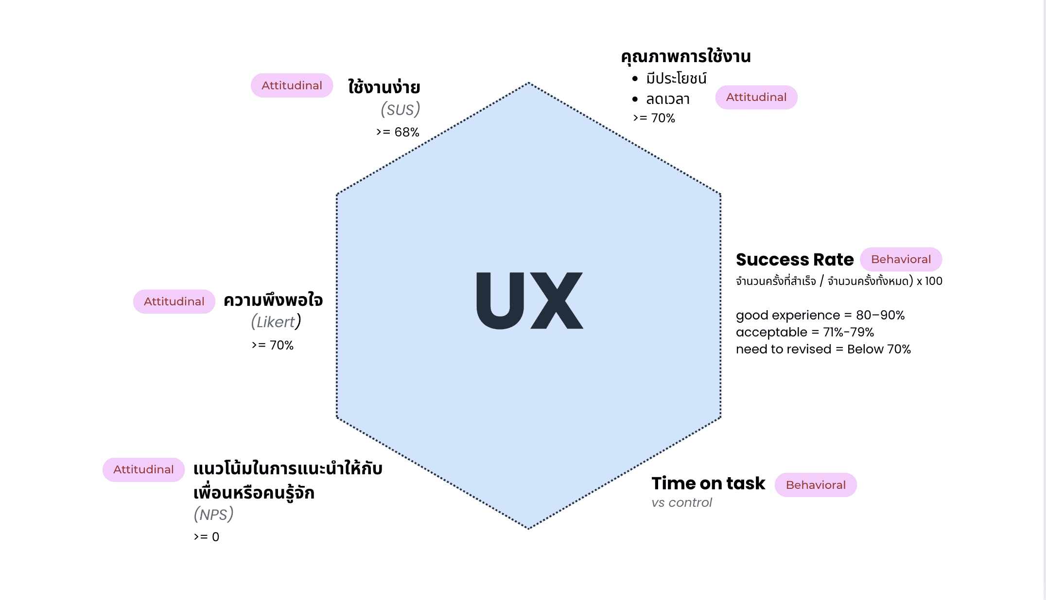
Acceptance Criteria of UX
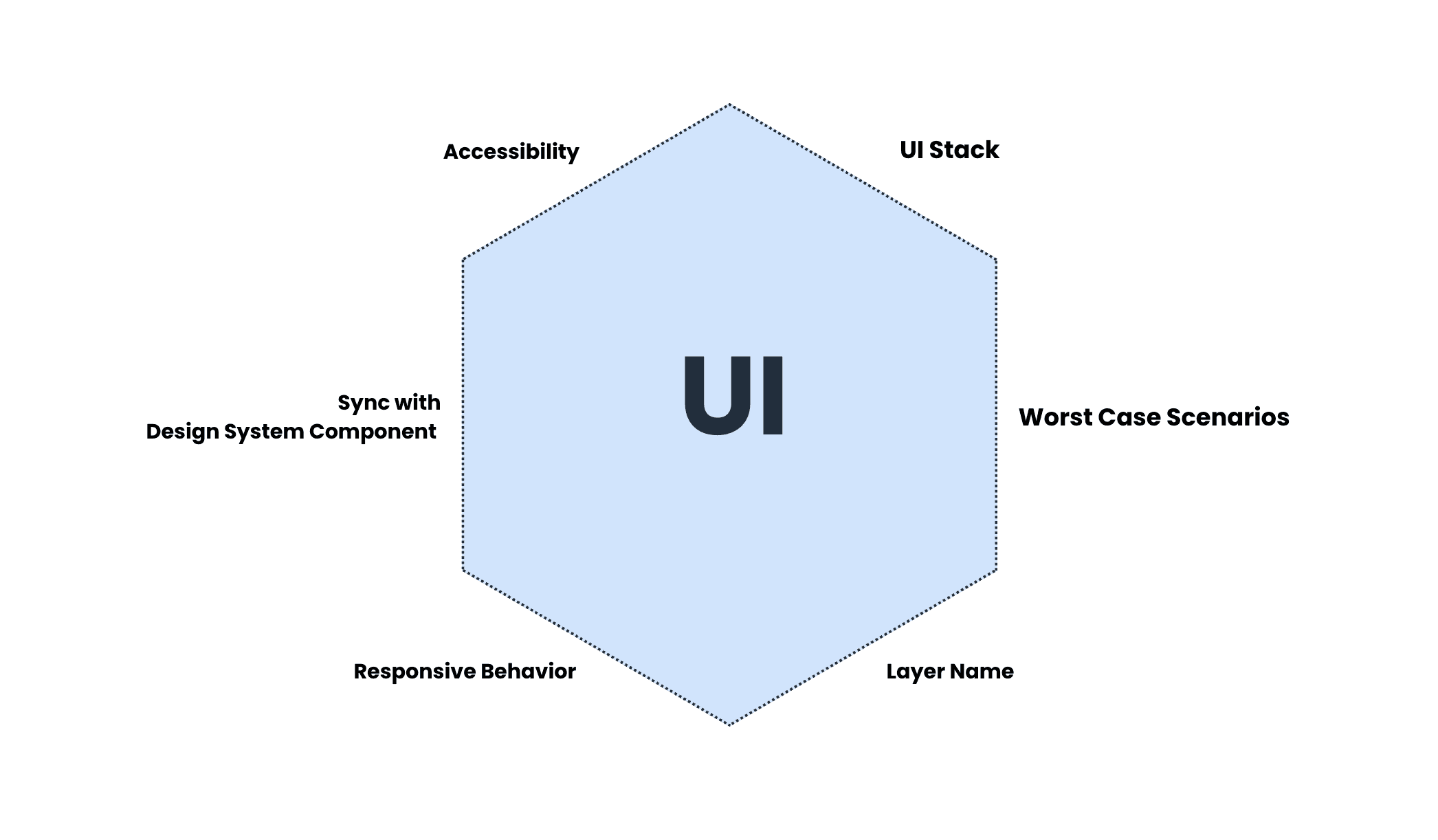
Acceptance Criteria of UI
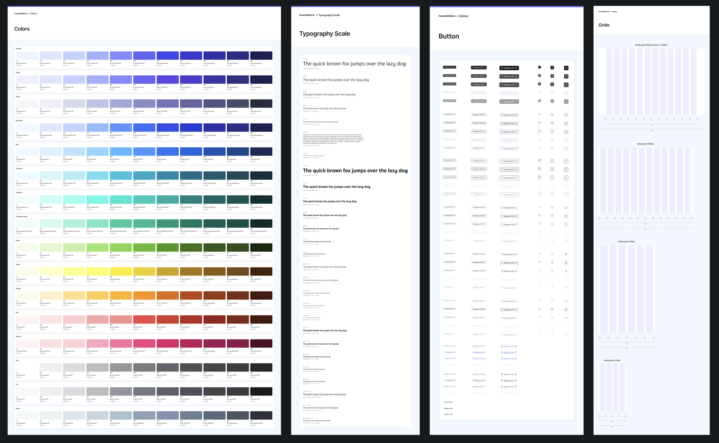
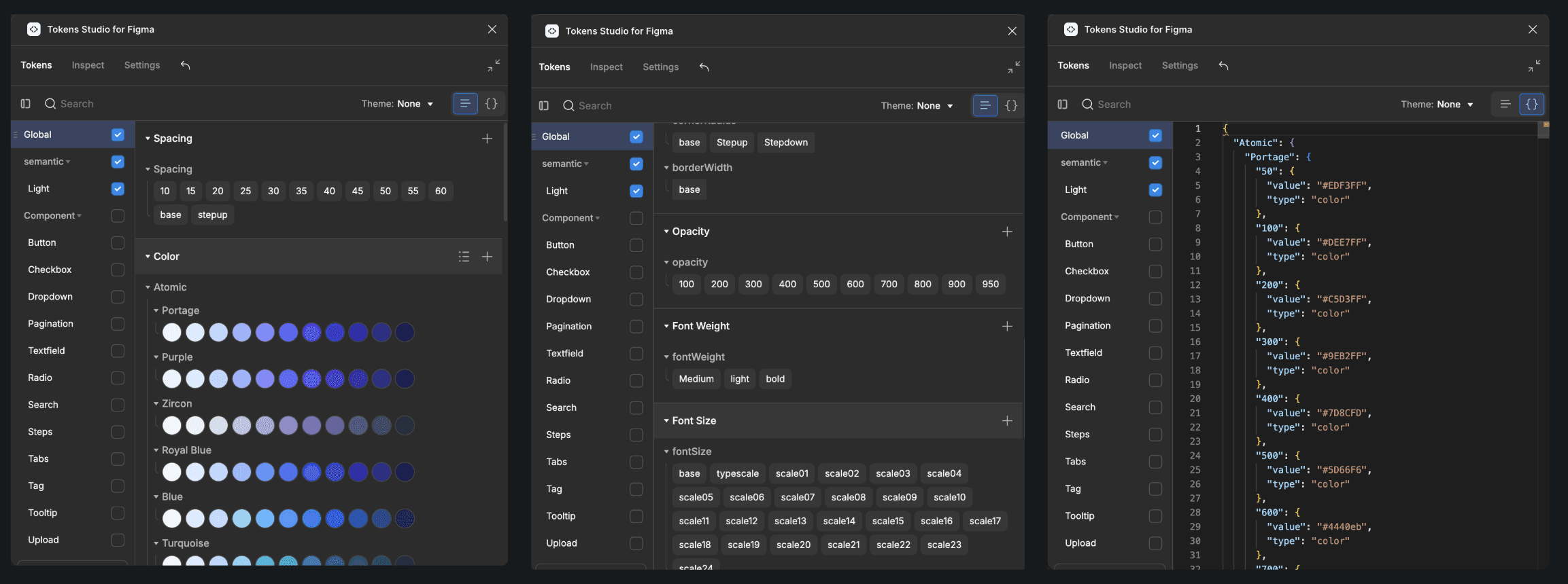
Design System and Design Token
I led the initial setup of the Design System foundation and structure, and delegated component-building tasks to the team to improve delivery speed.
Design tokens were defined to streamline developer implementation and support easy theme switching, including Dark Mode.
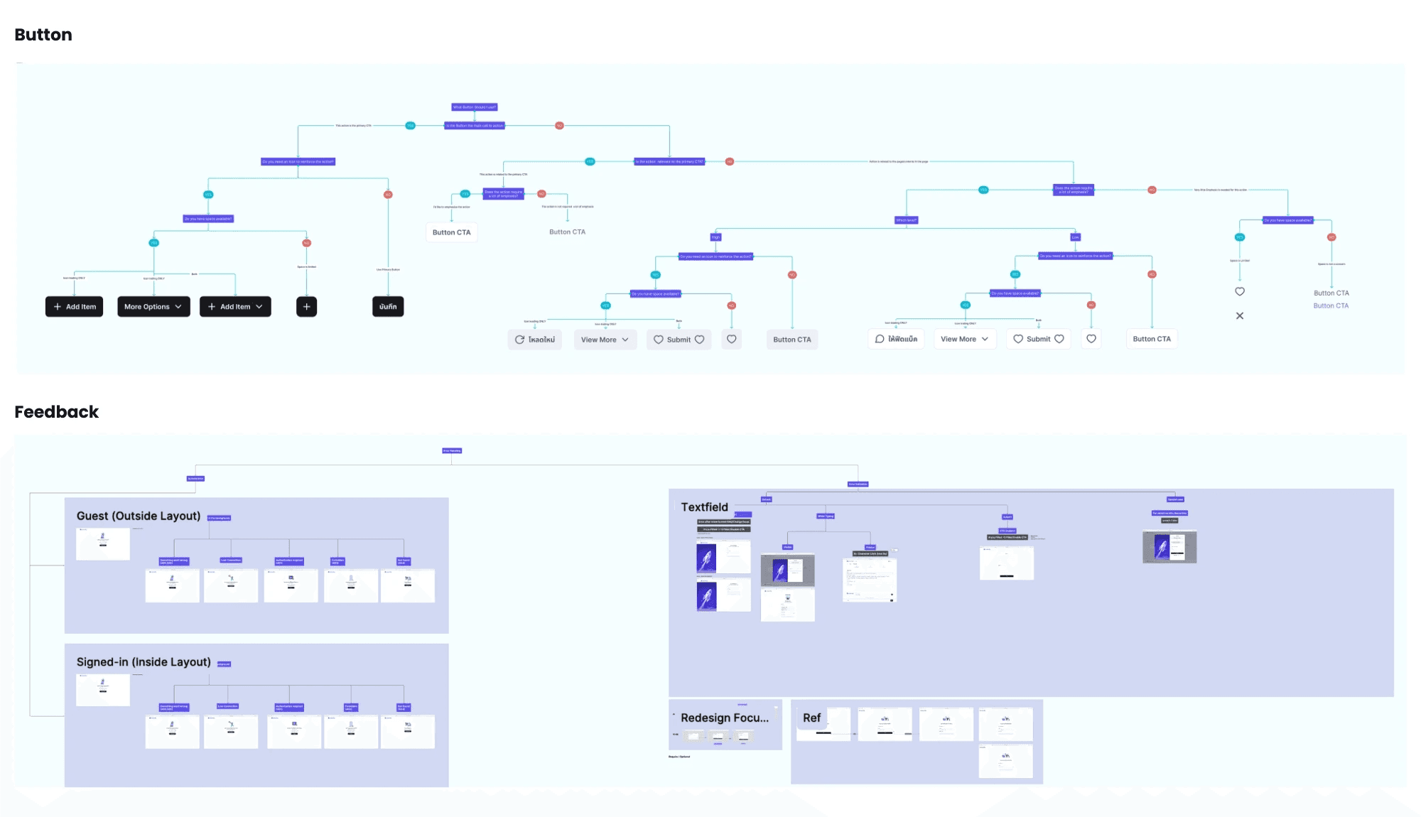
UI Component Decision Tree
We collaboratively built a UI Component Decision Tree to guide designers in choosing the most suitable UI components for different design contexts.
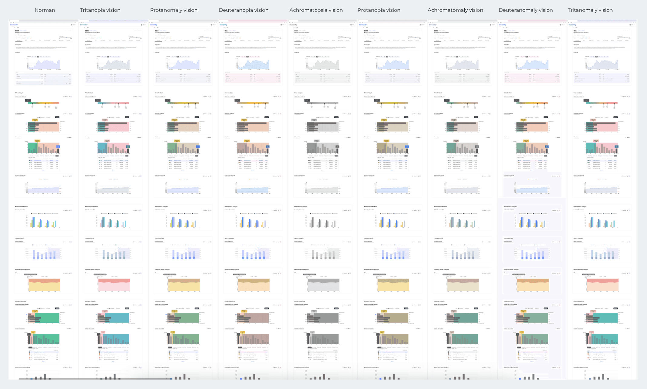
Color Blind Check
We validated and adjusted graph color palettes to support users with various forms of color blindness.
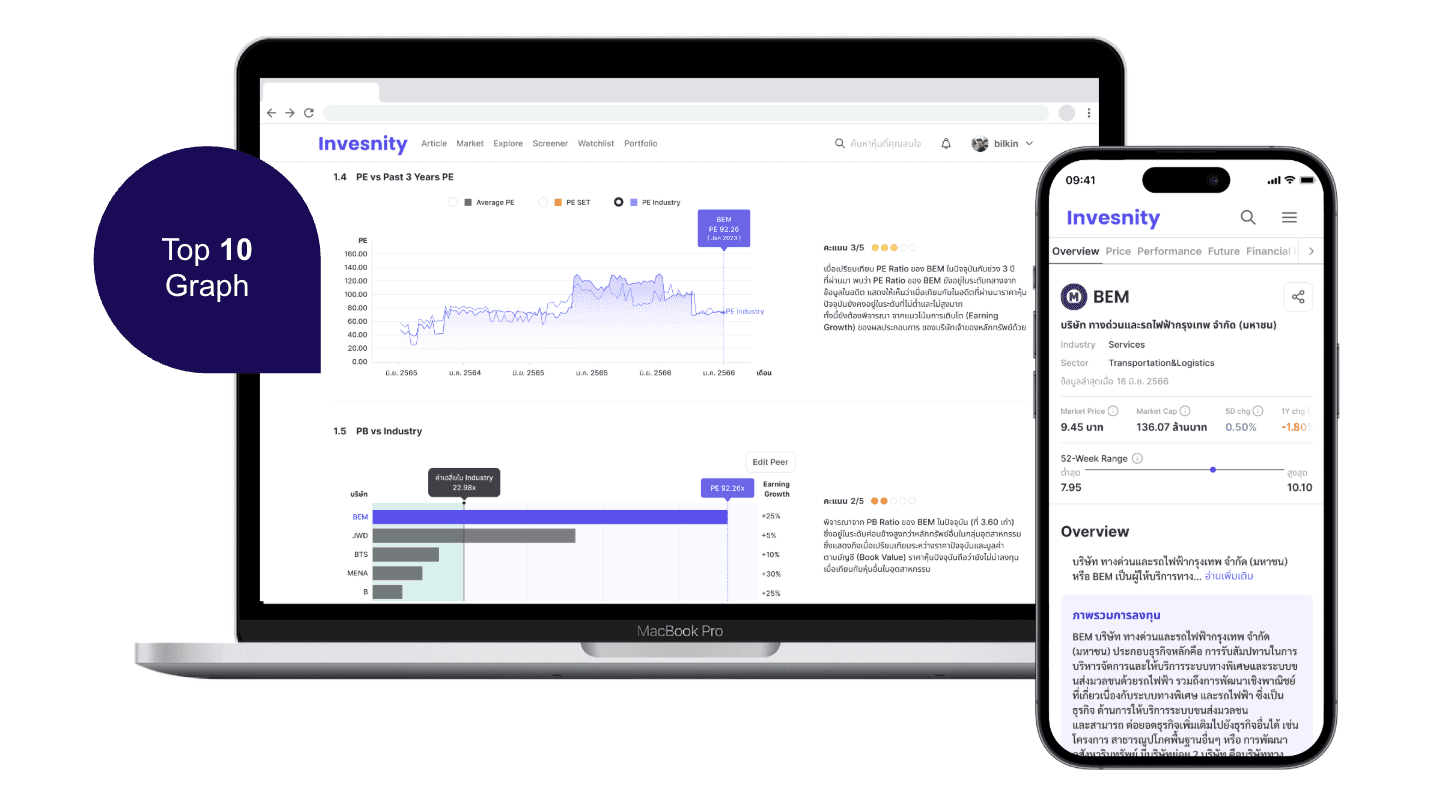
Stock Analysis feature
To scope the MVP, only 10 out of 20 available charts were selected for the Stock Analysis feature, focusing on the most essential insights.
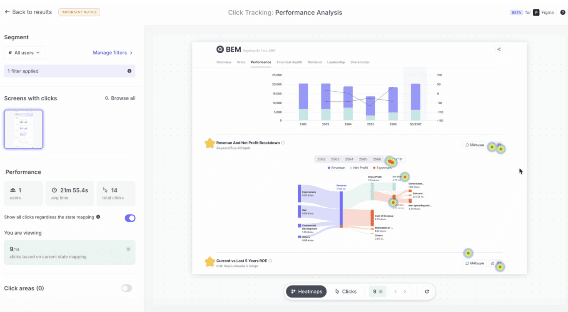
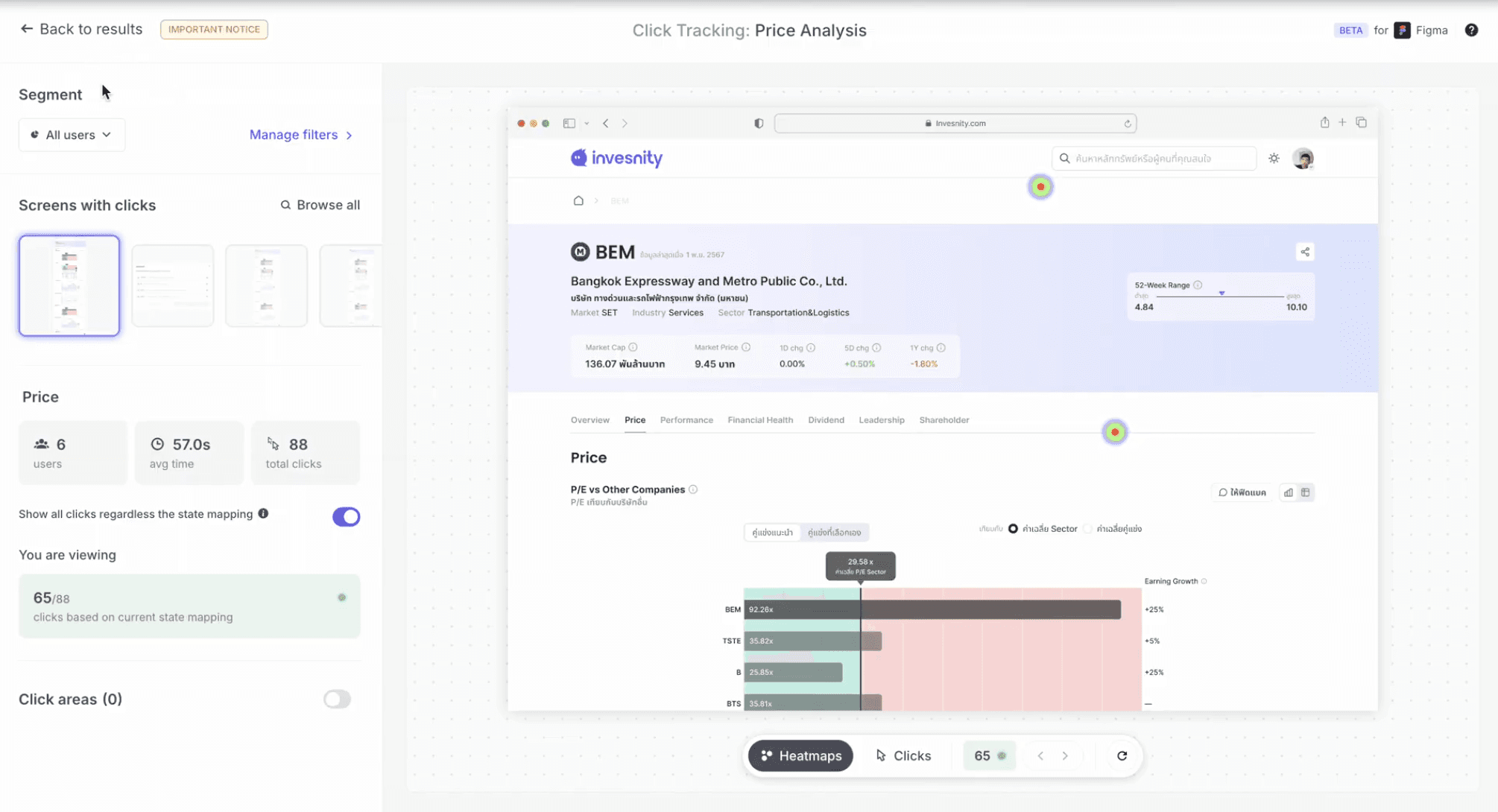
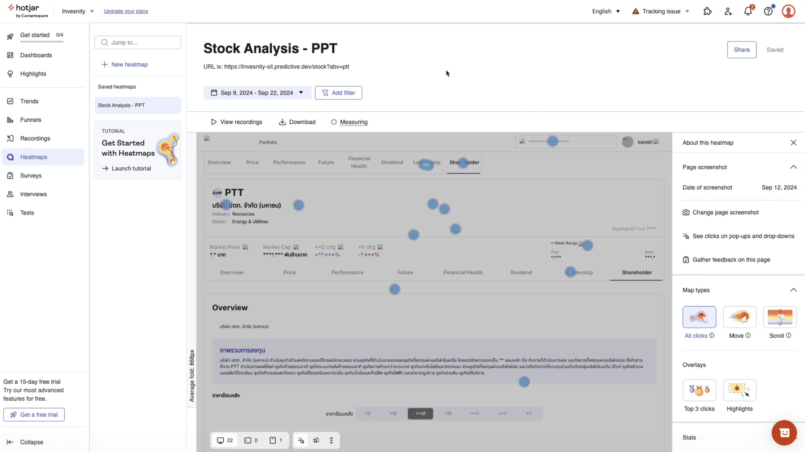
Hotjar, Heatmap
During the early launch phase, the web product was released to a selected waiting list. User behavior was tracked via Hotjar, while qualitative feedback was collected through an in-product feedback icon linked to Google Form.
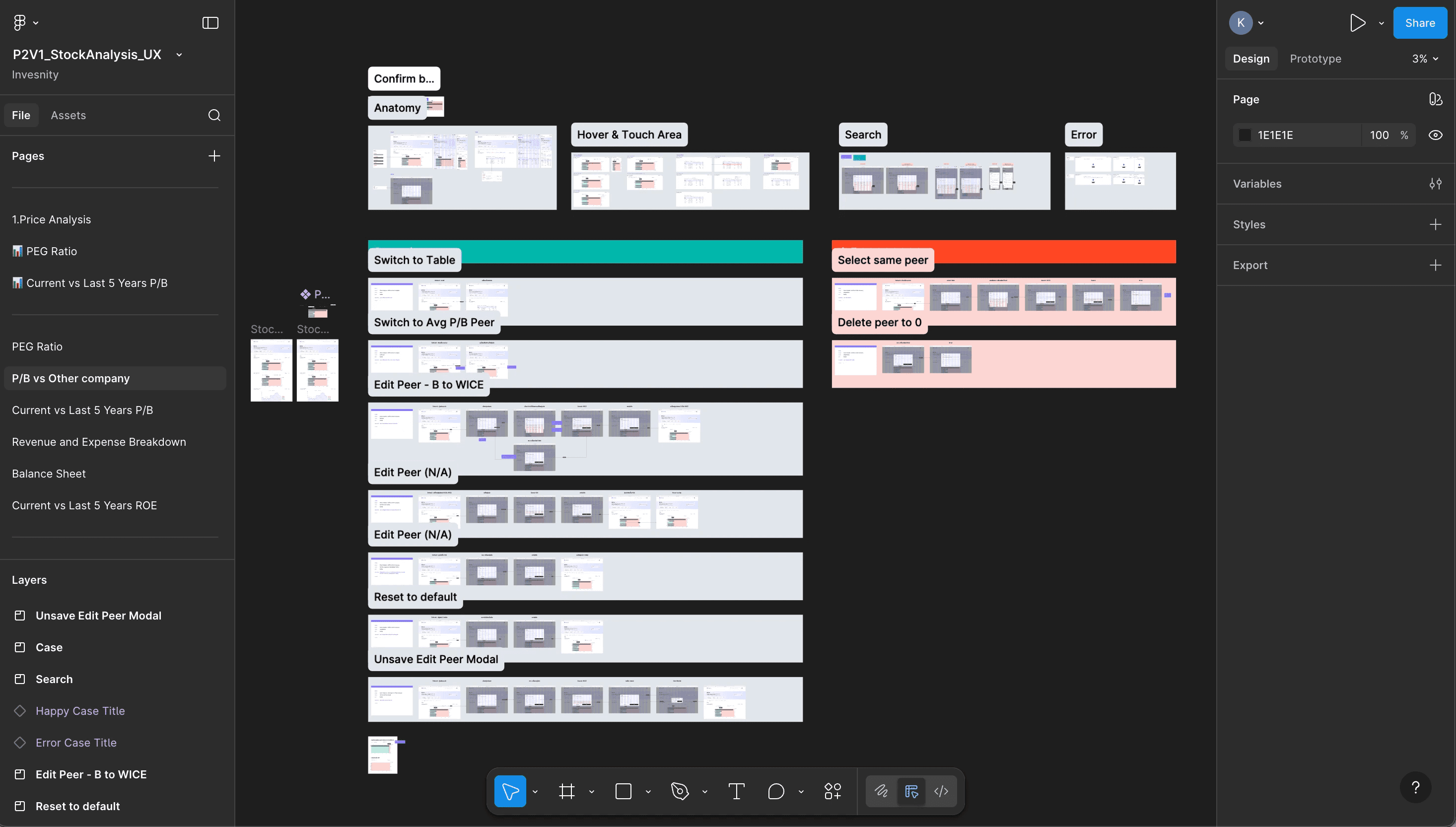
Deliverable
Design deliverables were provided in scenario-based formats, including both happy cases and unhappy cases to ensure comprehensive coverage of user flows.
User Interface
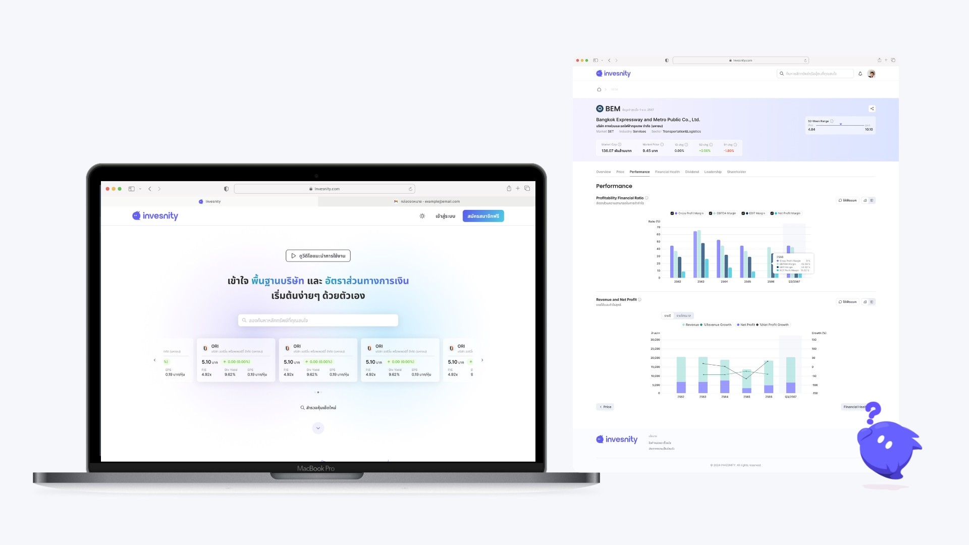
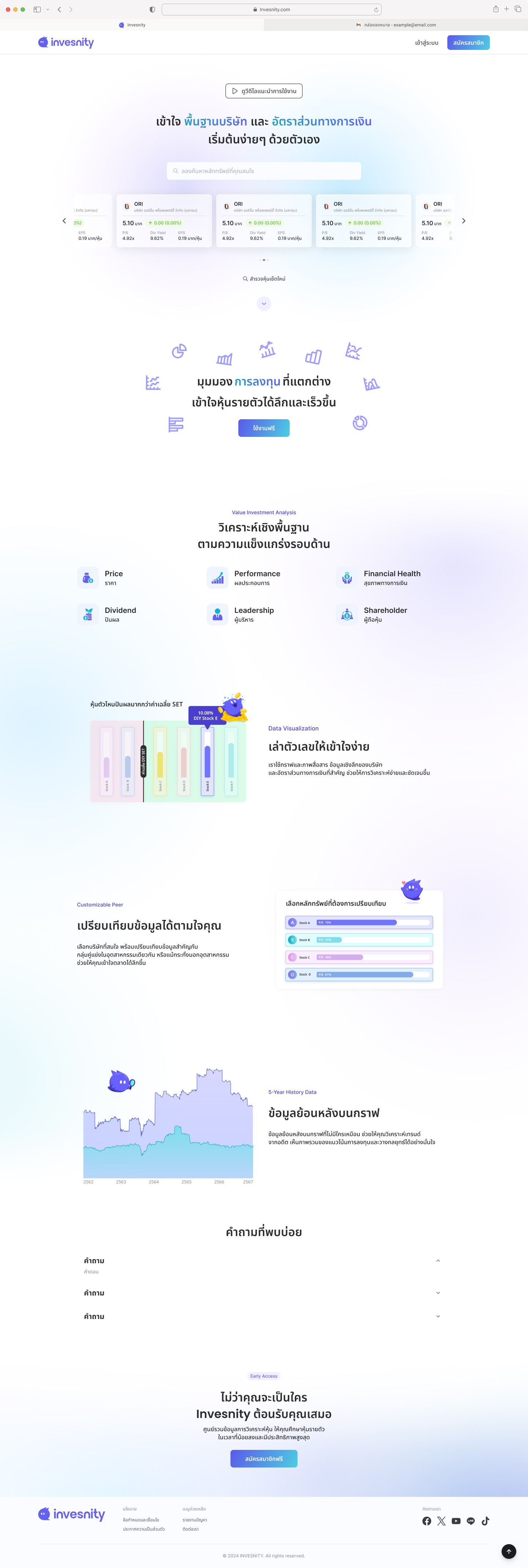
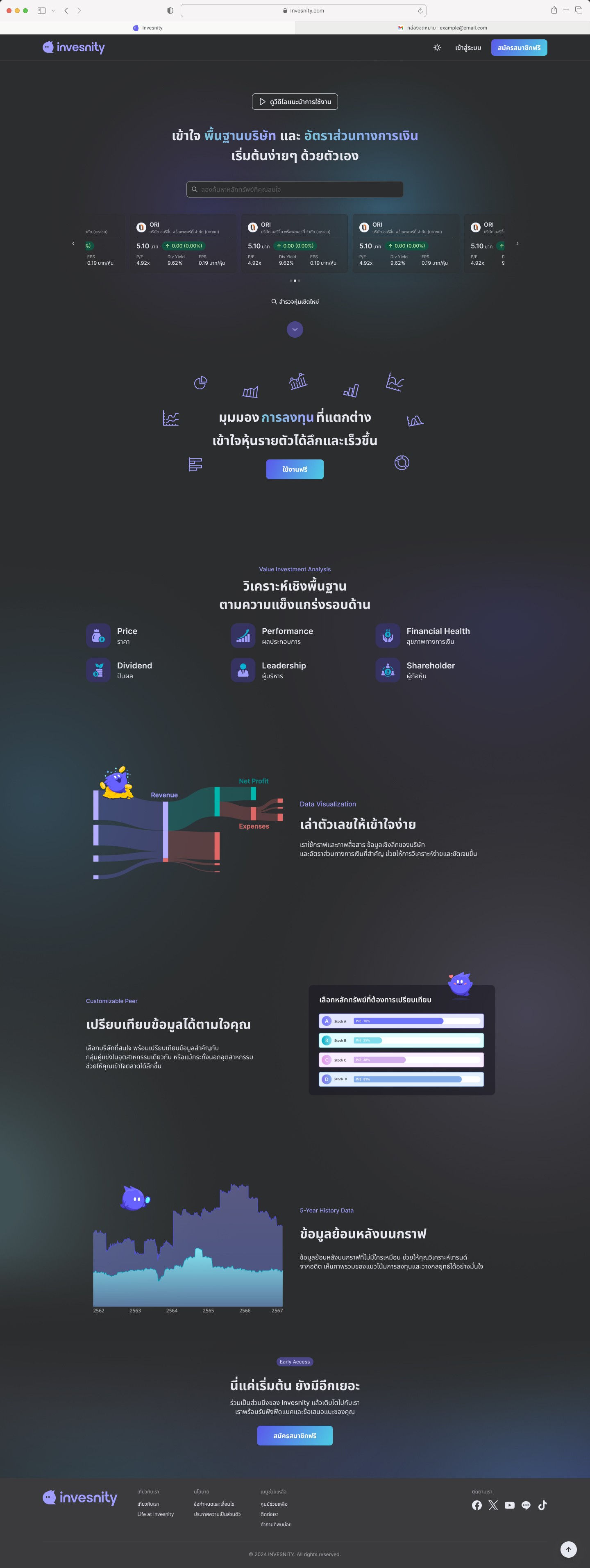
Landing Page
The landing page task was initially assigned to a junior designer. However, the outcome did not meet the expected quality standards, and I noticed the designer was under pressure and experiencing stress.
To address this, I stepped in to support by curating additional design references for each section, creating a stronger foundation in Figma, and refining the overall mood and tone. This provided a clear design direction for the junior designer to follow, enabling them to continue the work with more confidence and consistency.
Dark mode | Dark mode |
|---|---|
 |  |
Stock Data Visualization Peers
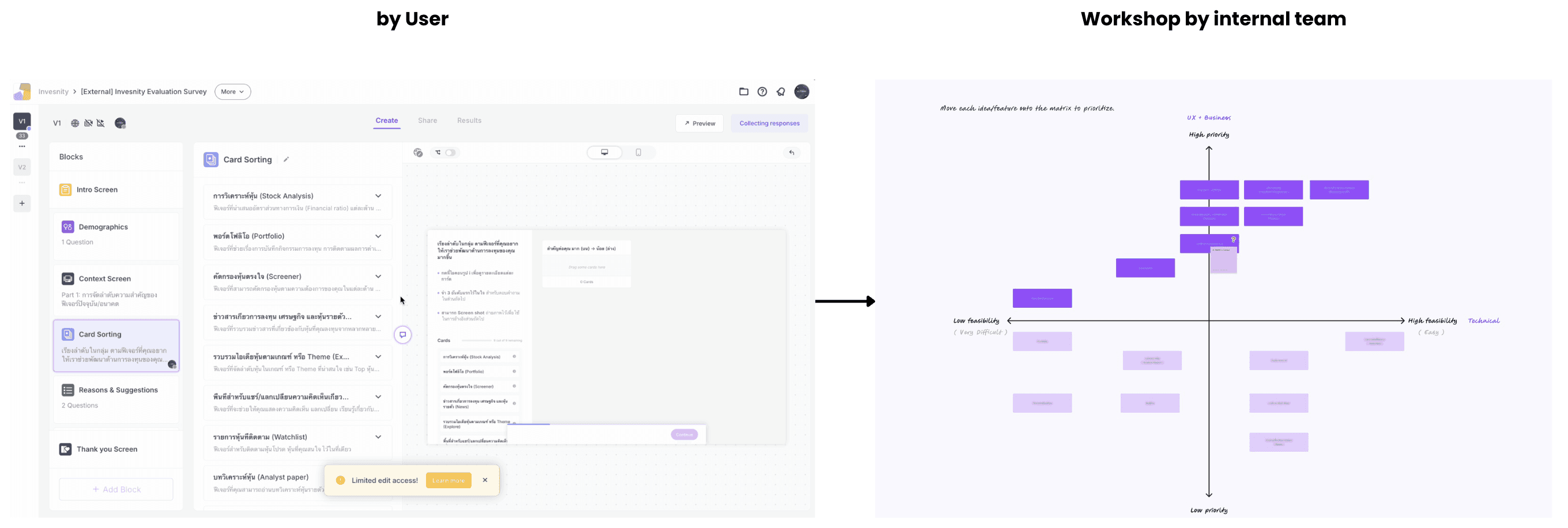
Prioritize the feature
Feature prioritization followed a two-step approach: user-driven feature ranking, followed by a cross-functional workshop - led by me - with the PM and developers to assess business impact versus implementation complexity.
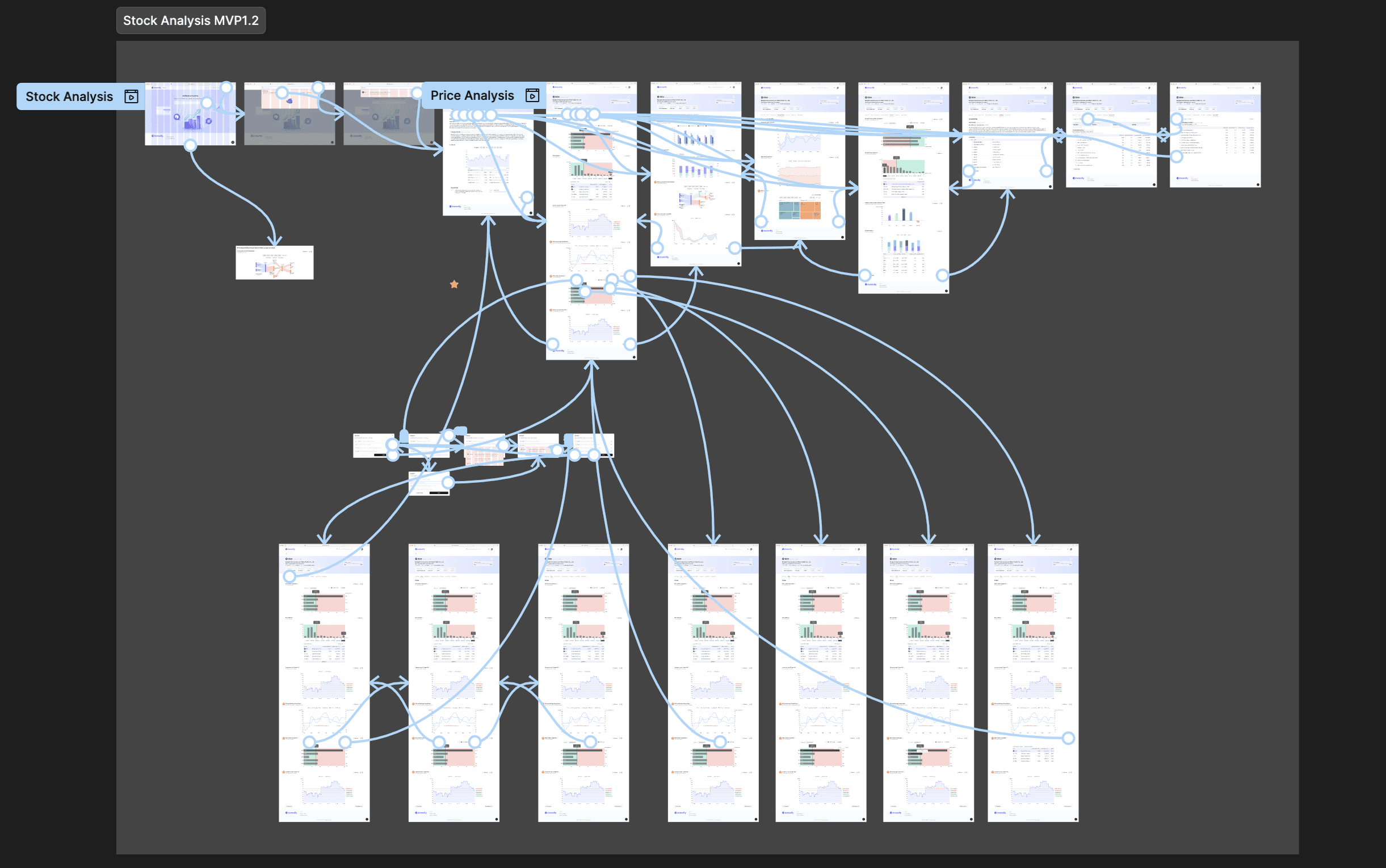
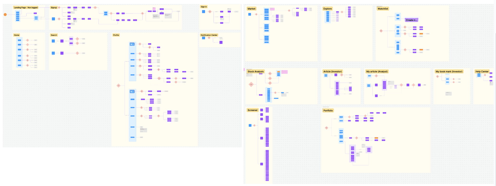
Created User flow
User flows were created to provide a clear overview of the entire website, enabling more effective task allocation across the team.
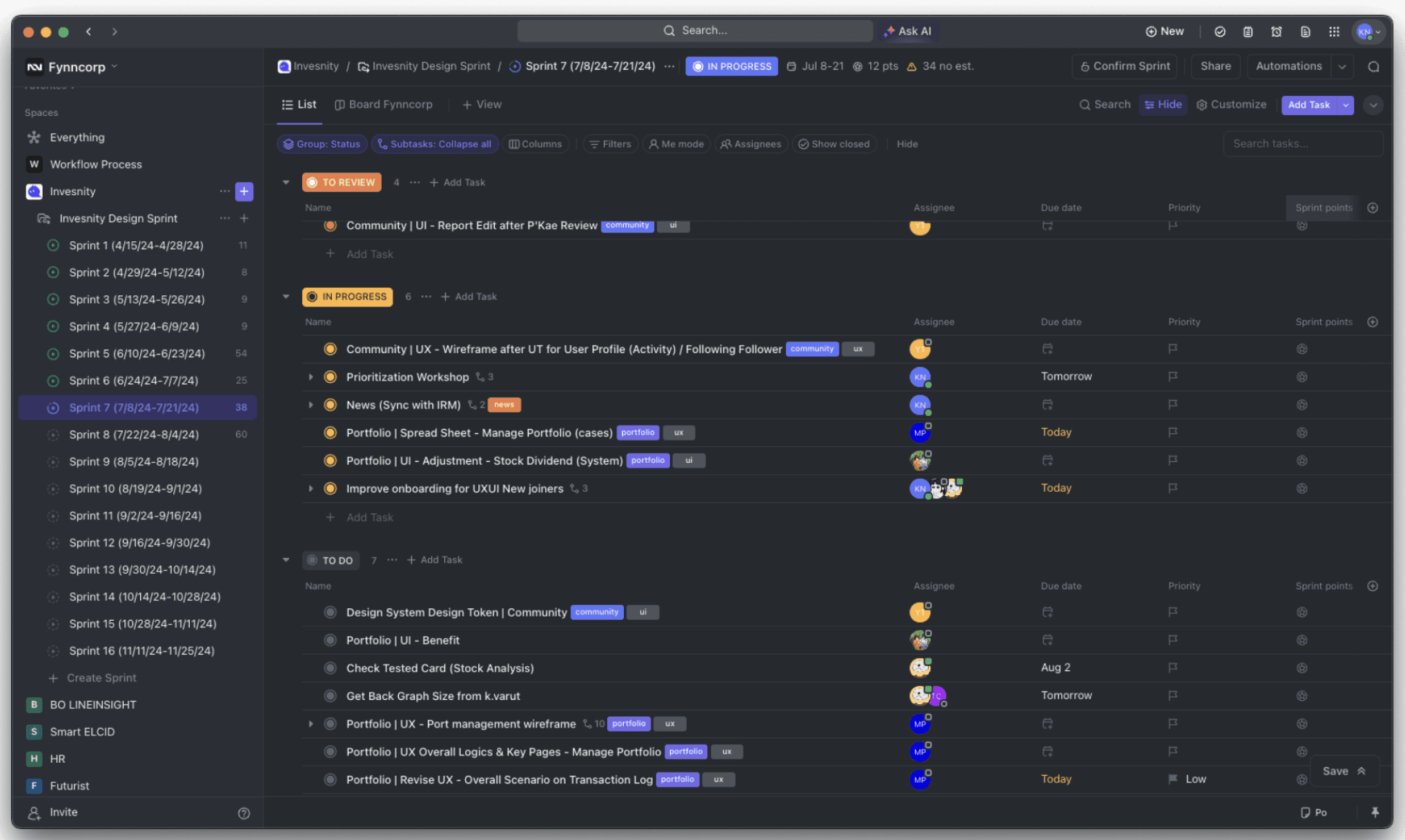
Task management on Clickup/Jira
I delegated and scoped UX/UI tasks to junior team members and tracked individual progress using ClickUp during the initial phase, before transitioning to Jira in the later stages of the project.
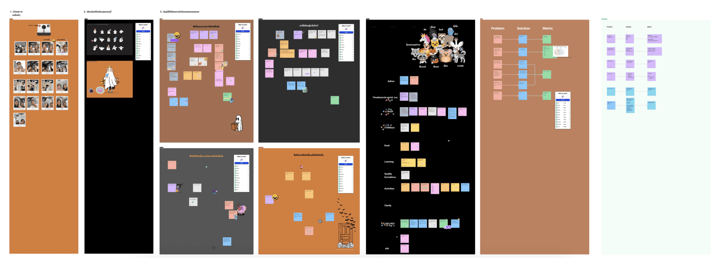
UX/UI Retrospectives
I facilitated UX/UI retrospectives once per sprint, creating an open environment for the team to reflect, voice challenges, and refine the workflow.